Optimizing UX for PLN Mobile Homepage: Addressing Information Structure and Product Navigation Challenges
Initated UX Audit for PLN Mobile Apps. We pinpointed key areas for improvement, including navigation, responsiveness, and overall user interface design. aim to enhance the app’s usability, ensuring a more intuitive and seamless user experience for PLN customers.

About PLN
PLN Mobile, an application developed by Perusahaan Listrik Negara (PLN), has established itself as a leading provider of electricity services in Indonesia. With a comprehensive range of features and personalized customer service, PLN Mobile offers convenient access and management of electricity services for the public.
Challanges
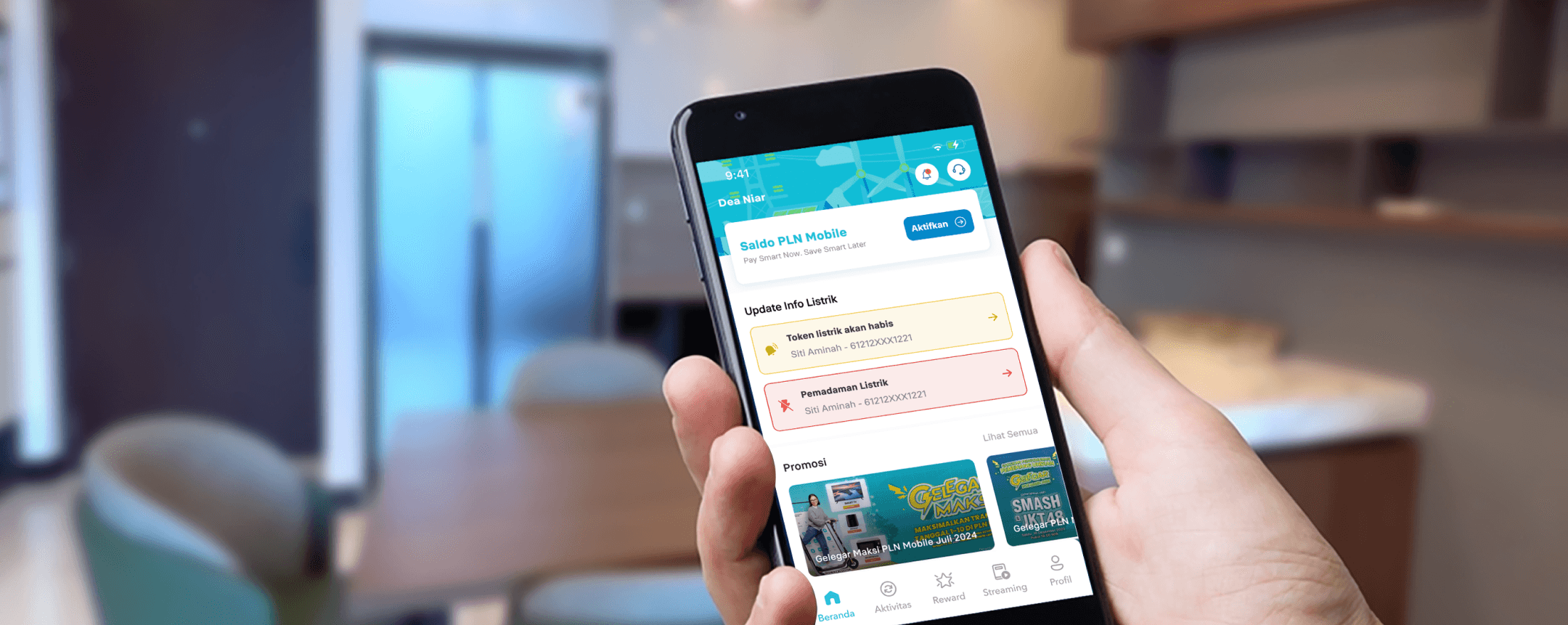
PLN Mobile as a First Customer Touchpoint
A deep understanding of the information structure on PLN Mobile's homepage is crucial for enhancing user experience (UX). Mobile applications play a pivotal role in connecting users with essential services. For PLN, this means bridging the gap between customers and critical electricity-related information.
Our analysis of the current PLN Mobile interface revealed several areas for improvement. These include confusing information repetition, inadequate emphasis on new features (resulting in overlooked information), and the necessity for clearer content presentation.

Process
Design Process for Excellent
Here are the key objective of this study case to achieve this
Discovery
To uncover deeper insights, we analyzed PLN application design using UI/UX principles (e.g., Hick’s Law, Miller’s Law).
Completed a design audit based on these insights.
Solution
Adhered to brand guidelines while creating a seamless design.
Emphasized flat design principles for PLN’s interface.
Heuristic Evaluation
Heuristic Evaluation : Insight & Prioritize
During our heuristic evaluation of the PLN Mobile app, we identified several critical UX issues that can be addressed through minor adjustments. A total of 29 major issues were uncovered, which we categorized into six areas. Our next step was to prioritize these issues based on their potential impact.

The homepage serves as the initial touchpoint for users, making it a crucial area for improvement. Every user encounters the homepage as they begin their interaction with the app. Therefore, optimizing this entry point is essential for a seamless experience.
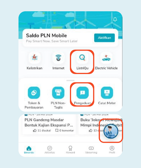
Users encounter varying mental models when accessing information. On PLN Mobile Homepage, some sections lead to specific categories, while others direct users to main features or informational content. This inconsistency might leads to interupt user find their needs where navigate the apps.

Result Card Sorting
Card Sorting : Results
To validate our analysis we conduct card sorting analysis to find what users think about the homepage. Pada prosesnya ini saya menggunakan 7 Card untuk melakukan card sorting dengan 5 kategori yang sudah saya sediakan seperti gambar dibawah ini:

Here are the key findings from Standardization Grid:
- Notifications should exclusively focus on notification-related features.
- PLN balance information belongs in the “Payment Services” section.
- PLN service products should be categorized under “Services.”
- Events, Information & Promotions, and PLN Magazine align with the “Learning - Article Base” section.
Based on the Similarity Matrix results, it can be highlighted as:
- 100% of respondents categorized “Information and Promotions” as part of “Learning and Articles.”
- 67% included “Events” and “PLN Magazine” in the same category.
- 67% associated “Bill Notifications” with the “Notifications” section.
- 33% of participants placed “PLN Balance Information” within “Services.”
My Objective
How might we create homepage that more clear and easy to navigate?
Here are the key objective of this study case to achieve this
Streamlined Information Architecture
Reorganize the app’s content structure to present information logically and intuitively. Users should effortlessly find what they need, whether it’s billing details, outage notifications, or energy-saving tips.
Intuitive Product Navigation:
Simplify the journey for users seeking specific services or features. From paying bills to reporting issues, the navigation should be straightforward and efficient.
Building Trust
Establish PLN Mobile as the go-to resource for accurate, up-to-date information. Users should feel confident relying on the app for their electricity-related queries.

Solution after Card Sorting
Heuristic Evaluation Insight & Prioritize
WeHere are the revamp version of the homepage
UX ISSUES #1
Pengaduan
Before
There are no instructions on where users can find the Customer ID
Form field placeholders are unclear whether they are clickable or not because their state appears to be disabled

After
Clearer Titles and Instructions
Guidance on Finding the Customer ID Using a Photo to Educate Users
Good and Educational Form Field Titles and Placeholders
UX ISSUES #2
Notification & Quick Action
Before
There are no instructions on where users can find the Customer ID
Form field placeholders are unclear whether they are clickable or not because their state appears to be disabled
After
Clearer Titles and Instructions
Guidance on Finding the Customer ID Using a Photo to Educate Users
Good and Educational Form Field Titles and Placeholders
UX ISSUES #3
Menu PLN Services
Before
There are no instructions on where users can find the Customer ID
Form field placeholders are unclear whether they are clickable or not because their state appears to be disabled
After
Clearer Titles and Instructions
Guidance on Finding the Customer ID Using a Photo to Educate Users
Good and Educational Form Field Titles and Placeholders