The Visual Design Behind : Niagahoster x KiriminAja v 1.1

For those abroad; Niagahoster is trusted by more than 500,000 registered clients from all over Indonesia, and Niagahoster is always committed to providing the best technology for your online success. Join and discover the ease of creating your dream website with Niagahoster!
Before moving on to the mockup stage, we did some research on colors and elements to use based on the Niagahoster design language and put KiriminAja elements, which are purple. We had to make sure that the elements between Niagahoster and KiriminAja were balanced. And we find this element.

Illustrations on Niagahoster x KiriminAja depict the daily activities of couriers, shipping goods, and monitoring package delivery by adding more element accents to make illustrations on Niagahoster x KiriminAja more fresh and emphatic. Then, for the color section we use blue and purple which reflect the colors of the Niagahoster and KiriminAja companies
Illustrations
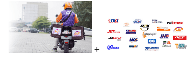
Moodboard 1 : Illustrating that at KiriminAja there are many shipping partners available
The Result

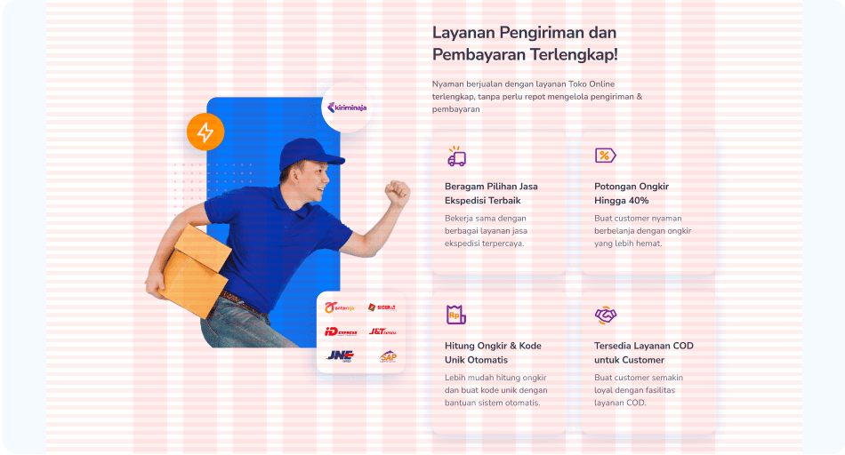
Moodboard 2 : Offline shop owners who want to publish their products on their shop's website so that they can be accessed by more buyers

The Result

And this the final result Illustration Niagahoster x KiriminAja

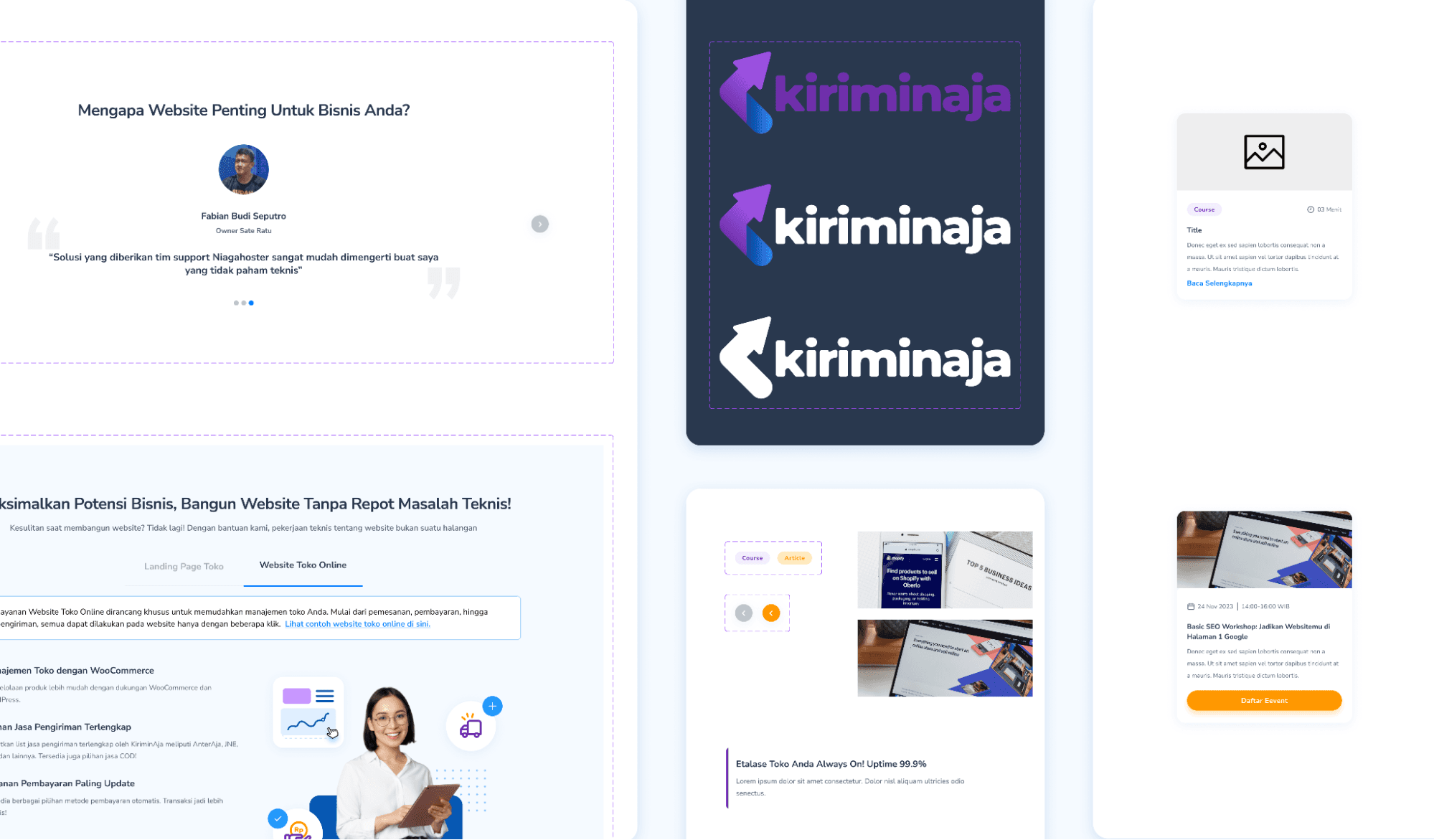
Icons
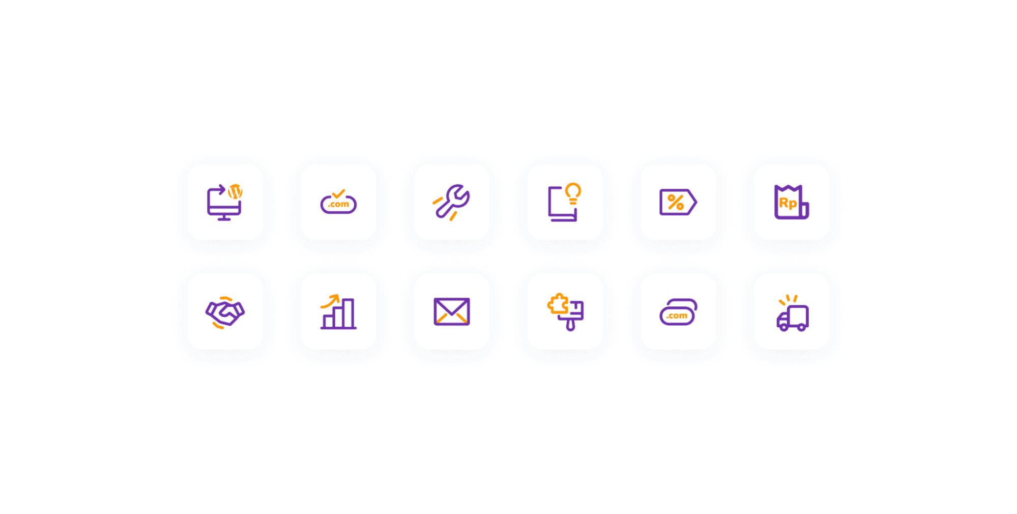
for the icon selection, we use icons that align with the objects they're trying to represent. We use a rounded style which can create a relaxed impression on the user. We also use two tone colors, or "duo,” which are purple and yellow, to better describe the company according to the color.
What is the purpose of UI style guides?
Before creating a product, almost every design team or company creates UI style guides. Why? The following are the advantages of implementing a UI style guide with your design team:
It encourages marketing and sales by using consistent brands.
It helps improve communication and collaboration between designers and developers.
It contributes to the development of uniform UI and UX throughout your products.
What should be included in the UI Style Guide?
Style guides should be able to help designers and developers work on the same visual design. So, here's what should be in the style guide:
Grid System
The grid system must have a few aspects, like a container, gutter space, number of columns, and margins. By default, a desktop has a 12 column grid system, a tablet has 8 columns, and a mobile has 4 columns.
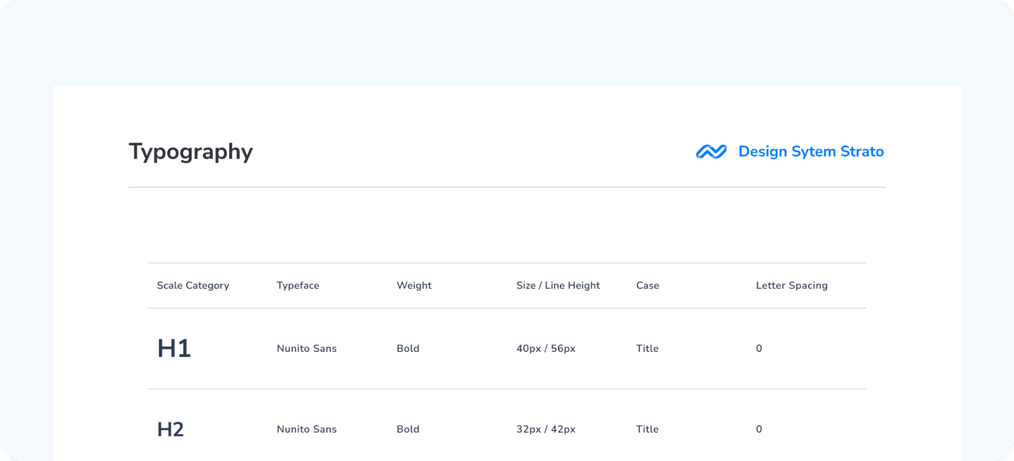
Typography
Typography has been used to create information reading patterns throughout the years, and yet it is such a powerful technique in every other form of design. At Niagahoster use Nunito Sans Family as Typography at Style Guide
Color
Color also has an important role in a product because it can create a unique identity and impression when you see products from certain companies.
UI Style Guide colors can be seen as follows:

Components
We already have a design system with quite complete components at Niagahoster, and the majority of components in this project use system design components. However, because this is a new project with Niagahoster and KiriminAja, we want to give this landing page a unique feel. So we made some of the components from scratch. This project's components are user interface elements that interact with one another. Each component serves a purpose, such as displaying information, performing actions, and so on. Buttons, FAQ Bars, Navbars, Sliders, and other components are defined in the design system.
Creating Alternatives
In creating high-fidelity, we are responsible for including elements from Niagahoster and KiriminAja. For that, we made several alternatives to find a truly balanced design.
Alternative 1

The first alternative is made with a purple and blue gradient background to represent the two brands. The purple and blue colors are also made 50/50 to make it look more balanced.
Alternative 2

For alternative 2 we use a layout like the usual Niagahoster landing page. But for the color, we will explore it again with a purple accent gradation.
Alternative 3

This alternative is made with a different layout from other Niagahoster landing pages to give a special impression.
After the hero design is made. We deliver all alternatives to stakeholders. Then in the end the alternative 1 hero will be used with consideration of style consistency with the merchanthost style.
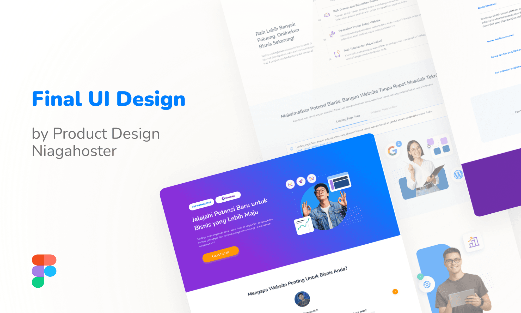
Final UI Design